- Behind the Scenes
The story behind the new Skiddle visual identity
-
By Ben Sebborn
- 13 Sep 2016
- 5 min read
September 2016 has been a big month for Skiddle, with a brand new visual look and output to match. It’s been a process which has lasted close to a year, with the visual side of things taking up a huge amount of planning and thinking.
We worked with Studio DBD to create our new look, utilising their involvement in the way we thought and planned the way our brand should feel across all aspects of our business. We spent a considerable amount of time really trying to figure out what Skiddle was all about, with discussions not only about what we thought the brand meant, but speaking to our ticket buying customers and the promoters we work with – as well as those that we don’t.
In the end this broke down to it’s simplest format as being about gigs, clubs and festivals and most importantly putting the customer first. Here are Studio DBD’s Dave Sedgwick’s views on that process:

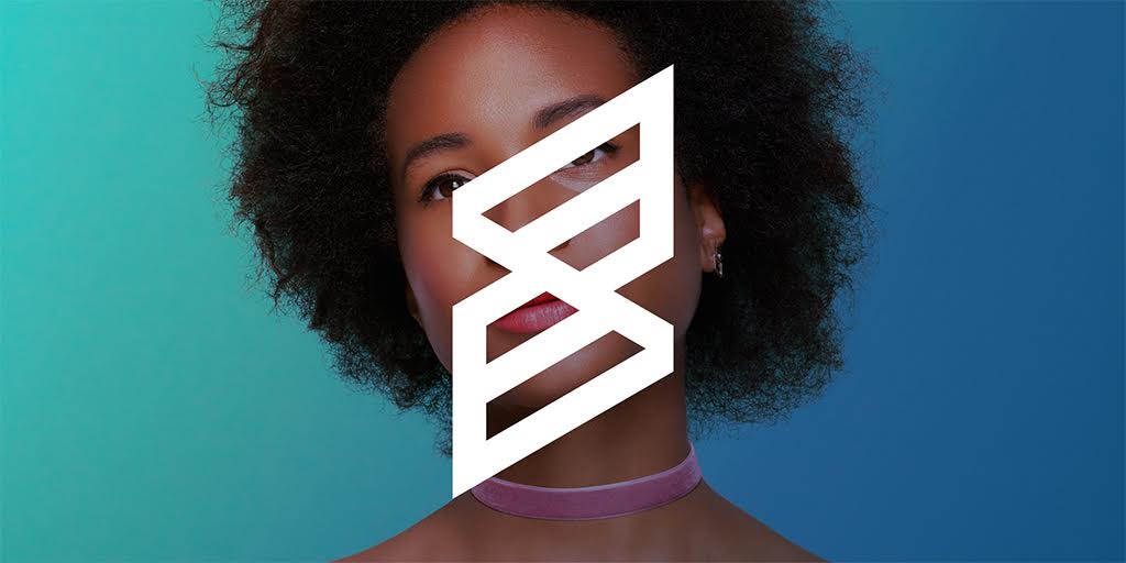
“Skiddle needed to completely clarify it’s brand identity. It had over the years developed into a number of aspects and so it was crucial to create an iconic symbol that referenced the three aspects of the company. We realised early on in the process the importance of trying to make sure the gigs, clubs and festivals message was obvious so we started to work on a triangle format and looked at ways in which this could translate into a logo.
This is where the new S logo comes from. It’s a graphic representation of gigs, clubs and festivals. We also decided that type wise we needed to be more friendly and a little softer, something we feel we’ve achieved.

Once we had the logo we began to investigate colours. The design team worked closely at all stages with Skiddle and we always tried to bring any concepts back to the idea of going to an event. One of the common themes of most events is the lighting and therefore the core key colours of red, green and blue became the starting point for the brand colours. We loosely associated a colour with each sector; red is for clubs, blue is gigs and green is festivals.
As we knew how important the customers were to the company we thought it would be a great idea to make the campaign literally all about them. We used social media to source a wide variety of customers who would be happy being the face of the new launch campaign. We started working with London based photography duo Ilka and Franz and together, over a period of two days, managed to shoot a collection of images which all feature in the new branding. We asked each skiddle customer to tell us about the last event they used Skiddle for and to summarise in three words (to keep consistency with the concept) how Skiddle had helped them or made them feel.

The final aspect of the branding was the use of graphic patterns to illustrate visually the essence of music and having a good time. This was a hard part of the project and one that really needed some consideration. With a bit of research we came across a person called Ernst Chladni, a German physicist and musician who had invented a technique to show various modes of vibration.
By running a violin bow along the edge of a metal surface covered with sand he saw gradual changes in patterns form ( you can see how this works in the video above). Variations of this technique are still commonly used in the design and construction of acoustic instruments. These ‘experiments’ formed the basis for our Skiddle patterns and provided us with a crucial part of the overall brand identity.”
Find more information on Studio DBD.